Project Overview
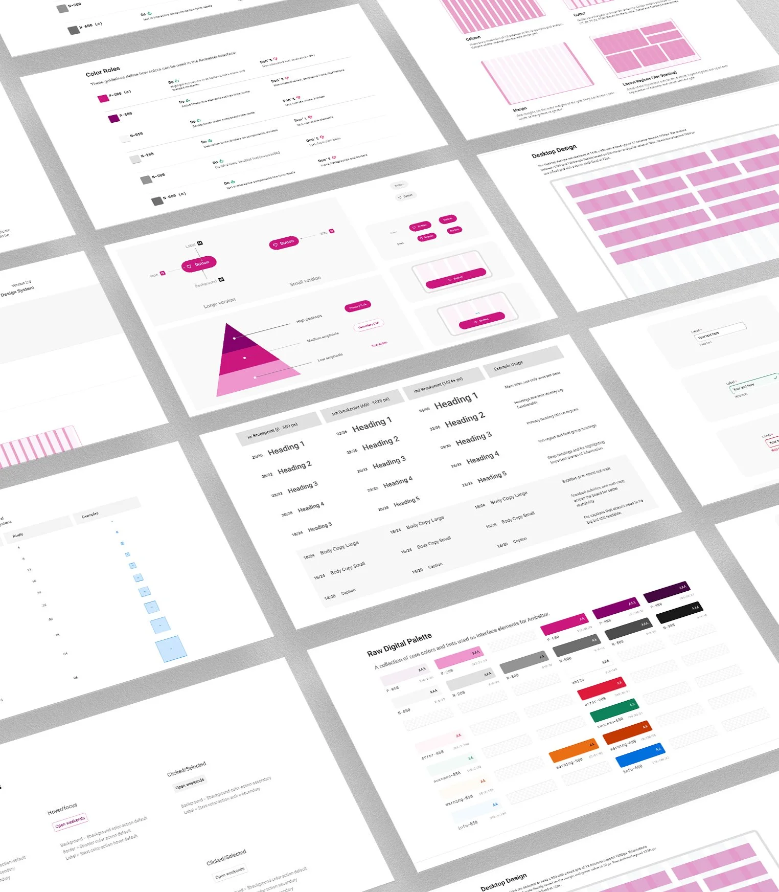
I was working in a team of 2 designers to develop A design system for one of the biggest healthcare providers in USA Ambetter health. It consists of a collection of reusable components, guided by clear standards, that can be assembled together to build any number of applications, and the need for them go hand in hand with the need for scale, efficiency, and consistency in Design.
We worked closely with our developers to create reusable components and tokens to insure consistency throughout all Ambetter applications.
Results
Documentation
A shared space where you say when and how to use the design system.
Visual language
Guide to what the brand feels like
Pattern library
Also called "component library" includes what you see above
Brand guidelines
Includes principles, tone and voice, writing style, and more
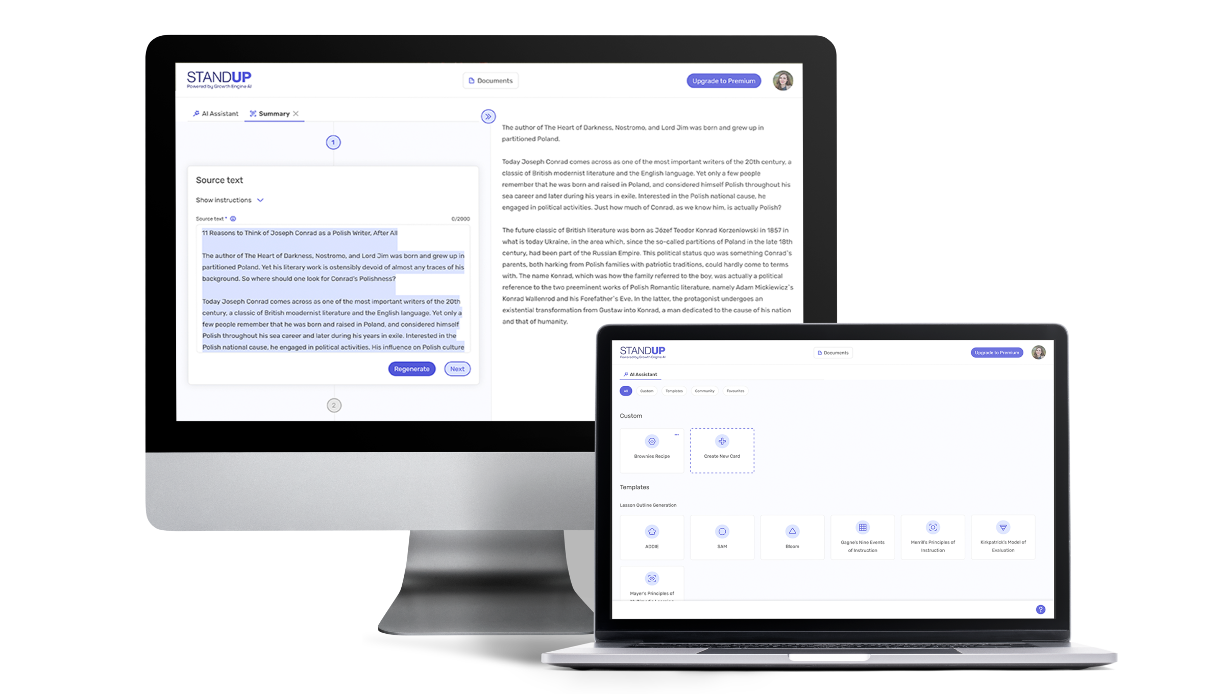
Growth Engine is an early-stage startup that came to us asking for help with their application's design. Their idea was to create a TikTok for training and knowledge sharing and to use the rising AI technology (Chat GPT API) for this purpose.
Problem Statement
Writing is a long and painful process. Whenever you write something you know it’s about re-writing. You need to correct mistakes and make sure your tone of voice is aligned with your audience. You often need to follow a certain structure, like a letter, quiz, recipe, or proposal. Your text needs to have a certain length. Sometimes it needs to be connected with other source texts, for example when you write an academic paper.
Although Chat GPT offers a brilliant piece of technology, it doesn’t focus on specific scenarios. And because it’s new and open-ended, it might be difficult for common people to write good prompts that will give the expected results. In other words, you need to know how to speak to AI so it could write what you want.
Project Goals
The goal of Growth Engine as a tech company was to adjust Chat GPT’s technology for specific writing use cases.
The goal for East Banc Technology as their consultant was to make sure that technology solves actual users’ problems and that the application is pleasant and intuitive.
Product Canvas Workshop
As an early-stage startup, Growth Engine had many ideas. But needed help with systematizing them and making decisions.
We started with a Product Canvas workshop. During the workshop, we wanted to define what are the goals of the application, who are their potential users and what their needs are, what would be features we want to have in an MVP (Minimum Viable Product), and what is nice to have but not essential (outside of MVP scope).
Following the workshop, the client came to the realization that they would benefit from a more robust business case and the guidance of someone with a strong background in business.
Competitors Research
They came back to us after 1 month with a new business-focused team member. They decided to focus on preparing teaching materials for salespeople. We suggested doing more research. Competitors' research to understand what is already in the market and user interviews to understand how training for salespeople is done in different companies and what are the problems connected with it.
We analyzed their main competitors and took into consideration things like content creation tools, organizing and managing content, content delivery, and assessments. We also took a deeper look into the interfaces of competitors’ applications.
User Research
We combined our and our client’s knowledge and assumptions to create research questions. This was used to interview sales managers to understand training struggles.
Pivot
With the help of the findings from our research, the client arrived at the realization that their initial concept of using TikTok for training was not the optimal approach. Consequently, they made the strategic decision to pivot away from targeting salespeople and explore other alternatives.
They decided to build a desktop application for generating questions, lesson outlines, summaries, writing proposals, and creating custom text formulas for repetitive use cases.
Design System and Mockups
Standup - that’s the application’s name, it didn’t have any branding, only a logo. So we took care of the color palette, typography, icon styles, and other building elements to create a scalable design system and consistent interfaces.
Results
The result of our collaboration with Growth Engine was a clickable prototype showcasing the main functionality of the product which helped software engineers build an MVP.
The product is live and available on standupai.com.
Overview
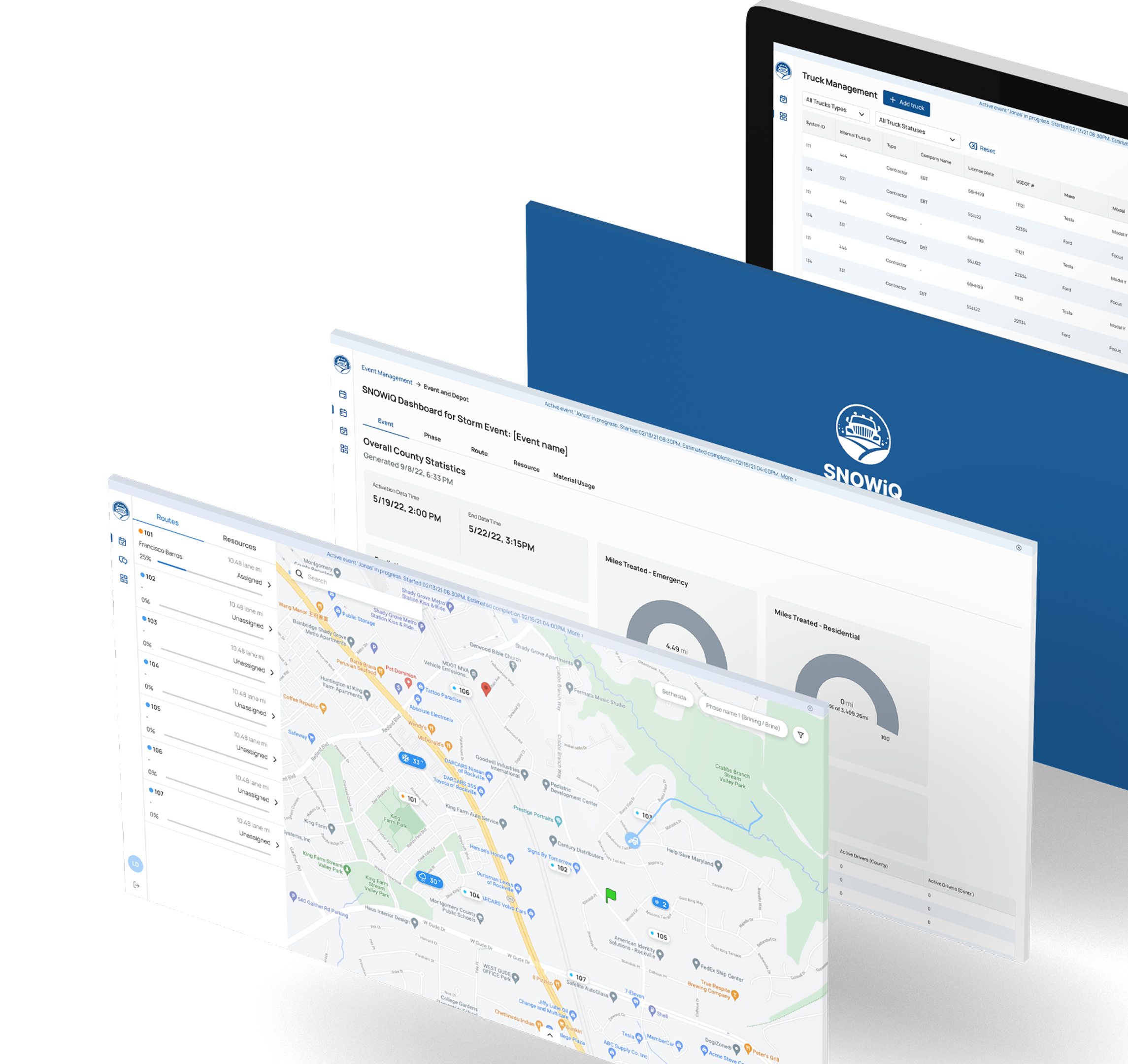
SnowIQ is a part of TerraIQ, an intelligence platform that uses real-time mobile tracking to power vehicles and asset management, specializing in snow management. The platform offers a comprehensive fleet management system and app, providing essential tools for municipalities and public safety agencies to manage their snow removal operations effectively and ensure road safety during severe weather events. As a modular enterprise SaaS platform, SnowIQ is designed to enhance efficiency, safety, and resource management during snowstorms.
My Role
I played a key leadership role in the end-to-end redesign and enhancement of SnowIQ, focusing on improving visual consistency, usability, and expanding functionality to better serve public safety agencies and municipalities. My responsibilities included:
Design System Creation:
Developed a unified design system for SnowIQ, ensuring consistency across all interfaces by standardizing fonts, colors, grid systems, iconography, buttons, and input fields. This approach streamlined future feature development and improved overall usability.
User Research & Collaboration:
Conducted user interviews and feedback sessions with supervisors, and field operators to gather insights and refine workflows. Worked closely with engineers and product managers to integrate user feedback into the design.
Multi-Role Dashboard Design:
Created dashboards for various user roles, including Supervisors, Drivers, and Contractors, enhancing their ability to track operations, monitor road conditions, and respond to emergencies in real time.
Feature Enhancements:
Led the design and implementation of several critical features, including:
Messaging, Video, and Audio Communication:
Enhanced communication systems by adding chat, video, and audio calls, enabling smooth collaboration during storm events.
Phase Management:
Introduced the ability to manage multiple active phases, reflecting the reality of complex snow operations during storms.
Editable Routes and Assignments:
Improved flexibility by allowing managers to modify assignments and routes before phases begin.
Road Conditions Monitoring:
Added a new page allowing users to report real-time data such as Road and Air Temperature, Precipitation Type, and Quantity.
Truck Management Portal:
Enhanced truck profiles to include more detailed information, making it easier for contractors to manage and monitor their trucks.
Notifications System:
Designed notifications to deliver essential updates to Supervisors and Drivers promptly.
Improved Navigation System:
Reorganized the platform's structure to separate Active Event operations from Administration functions, improving usability for all user roles.
The Problem
Public safety agencies and municipal departments faced difficulties in coordinating snowplow fleets, managing resources, and ensuring road safety during extreme weather events. The previous system lacked:
Real-time tracking capabilities.
Comprehensive communication tools.
Intuitive interfaces for multi-role users.
Predictive analytics for proactive decision-making.
The Solution
SnowIQ was developed and redesigned to address these pain points by:
Providing real-time tracking of snowplows, road conditions, and operational status.
Creating a unified design system for consistency and efficiency across all modules.
Adding critical features like Phase Management, Road Conditions Monitoring, and Enhanced Communication Tools.
Ensuring usability across desktop, tablet, and mobile environments.
Impact
Reduced response times by 20% during severe weather events by providing accurate, real-time information and actionable insights.
Improved user satisfaction by making the platform more intuitive and accessible across all devices.
Enhanced communication and coordination between dispatchers, field operators, and supervisors.
The goal was to develop branding, book design and a website to launch it this summer 2024. The book is about AI and how it's being used in many industries – and how you should use it to drive your own digital transformation.
Website design
I designed a website that would includes short description of the book, testimonials, preview of the book and a direct link to purchase the book. The website serves as a promotion for the upcoming book launch.
Book design
The goal is to generate illustrations for each book chapter. Avoid obvious references to the subject-matter of each chapter. Instead, we must align the dystopian nature of the cover with the chapter illustrations to convey a sense of wonder and unknown, while telling a story that deeply associates with certain references made on each chapter
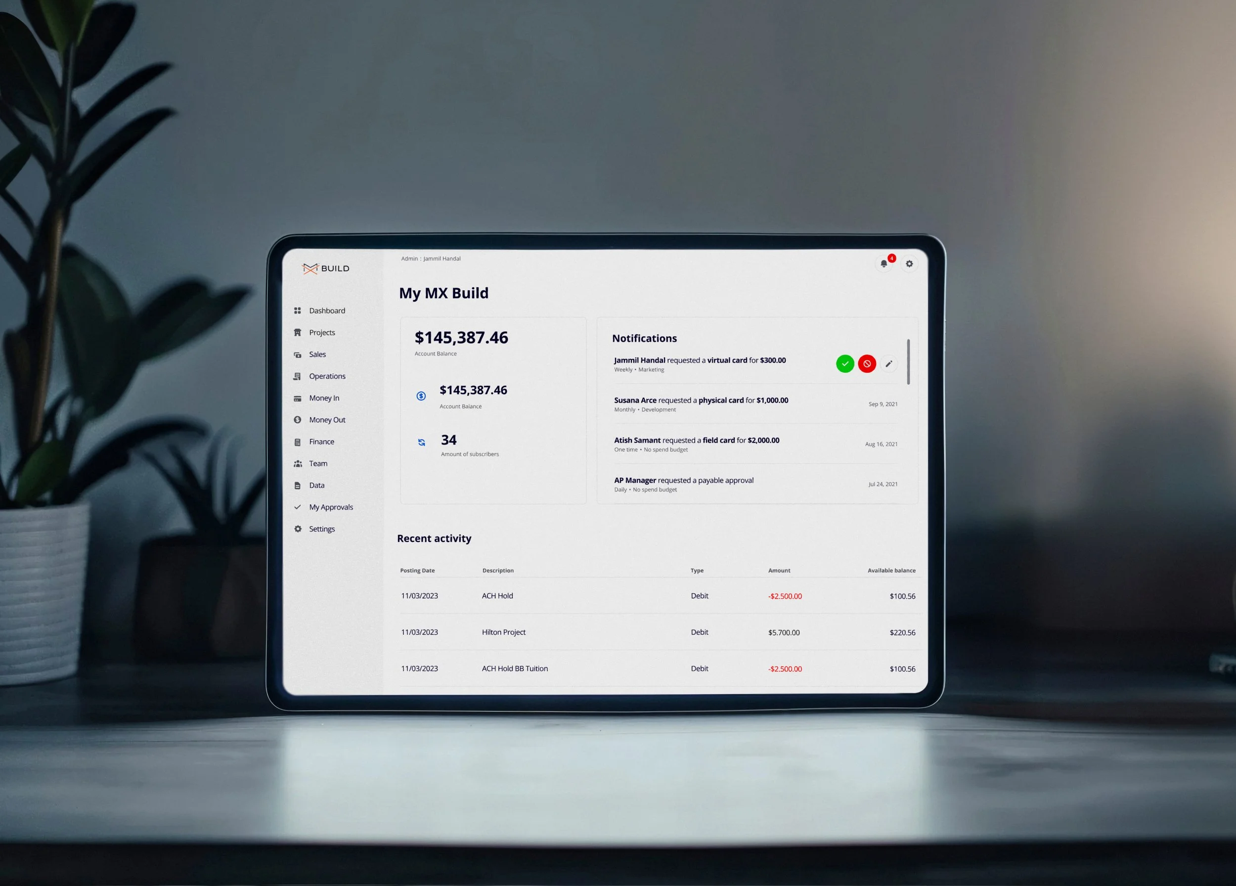
MX Build — Construction Management Platform
MX Build is a construction management platform designed to help teams plan, track, and control complex projects with confidence. The platform brings together financial data, schedules, and project performance into a single, cohesive experience—supporting fast decision-making in high-pressure, data-heavy environments.
I led the end-to-end design of the product, including UX/UI, brand identity, and a scalable design system. The work focused on reducing cognitive load, establishing clear hierarchy across dense data interfaces, and creating a flexible system that supports both current needs and long-term product growth.
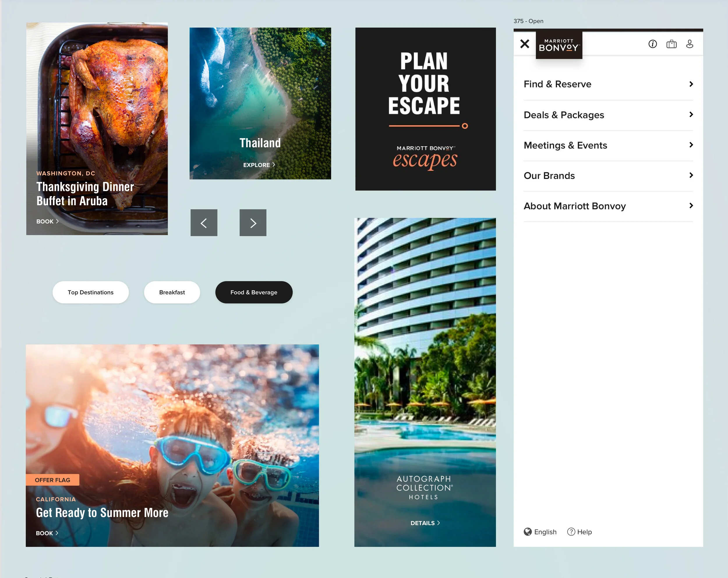
NGOP Project description:
Marriott’s Next Generation Offers Platform (NGOP) reinforces Marriott’s direct booking value proposition and allows customers to find the best value and get the best out of their travel experience through bespoke / curated offers and personalized content.
NGOP is one of the top priority programs for Digital in 2019. The program has tremendous visibility & support from the Global Officers and aggressive growth goals for revenue, enrollments and co-brand.
Business Problem:
The current offers on Marriott.com are underutilized because of guests’ perception that the offers provide little value, and that Marriott.com is not the appropriate place to search for deals
Design Goals:
• To unify the experience across all digital touch points
• Rethink the current state to create a more connected and engaging platform
• Leverage the sense of immediacy on mobile apps to surface deals at opportune moments
• Create an instantly recognizable, personalized approach to deals
My role:
Art direction, User research/testing, User flows & wireframing, UI design
Gathered requirements from the product team
Collaborated with the research team to gather quantitative and qualitative data about our users and their needs
Given research and requirement input, created use cases and task flows
Developed (low-fidelity) wireframes and an interactive prototype via Invision; tested prototype and implemented feedback from key stakeholders (e.g., biz team, product owner)
Post-testing, designed UI for high-fidelity interactive prototype
Defined features for MVP product
Coordinated with engineering team to create user stories and launch finalized product
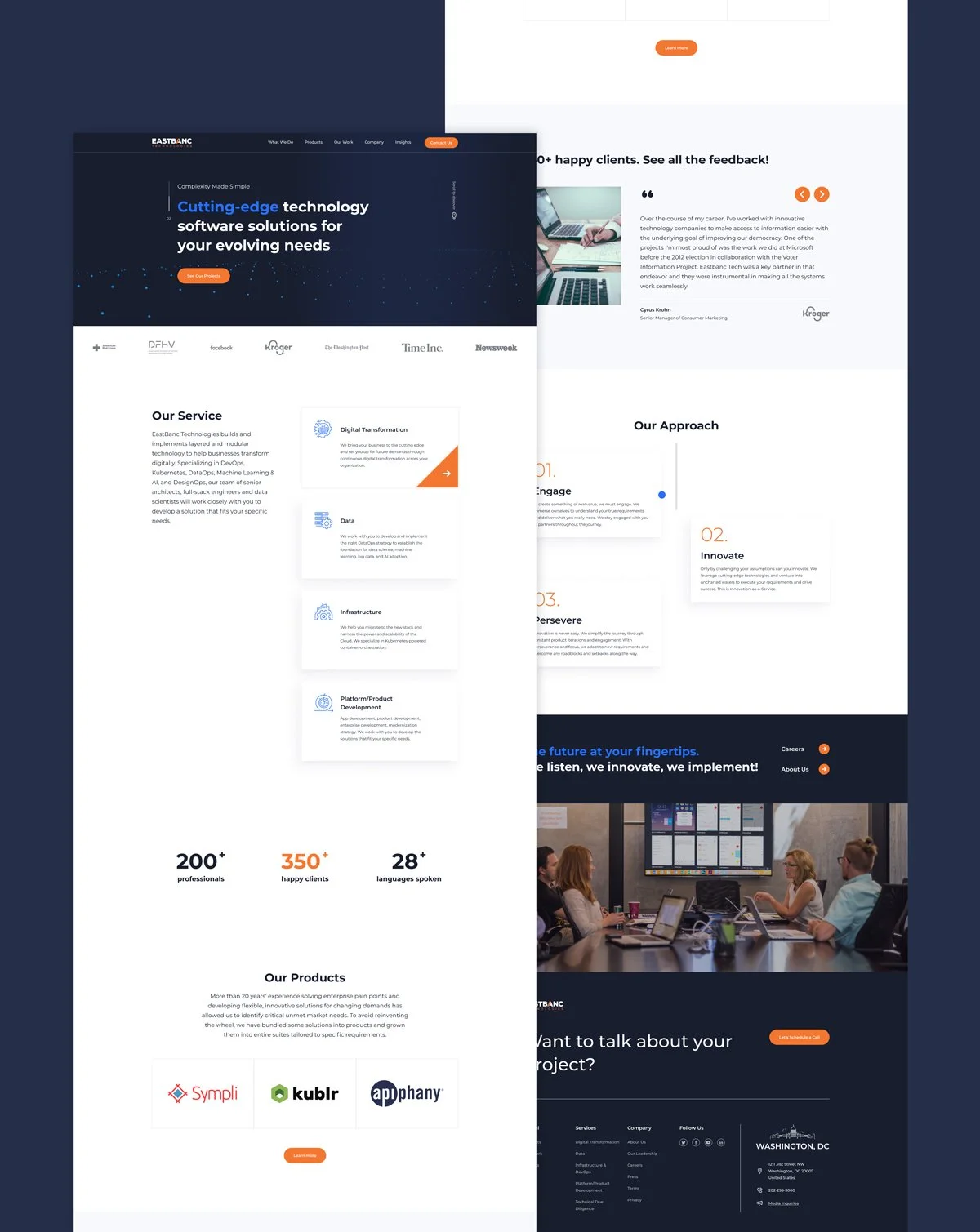
I'm thrilled to present the successful rebranding journey for EastBanc Technologies, where I transformed their brand identity to align with the modern tech landscape while retaining their core values and vision. This rebranding effort encompassed a complete makeover, including refreshing colors, contemporary fonts, and a refined writing voice. In addition to creating a new brandbook I led an effort to create a new website eastbanctech.com by collaborating with our designers, developers and marketing team.
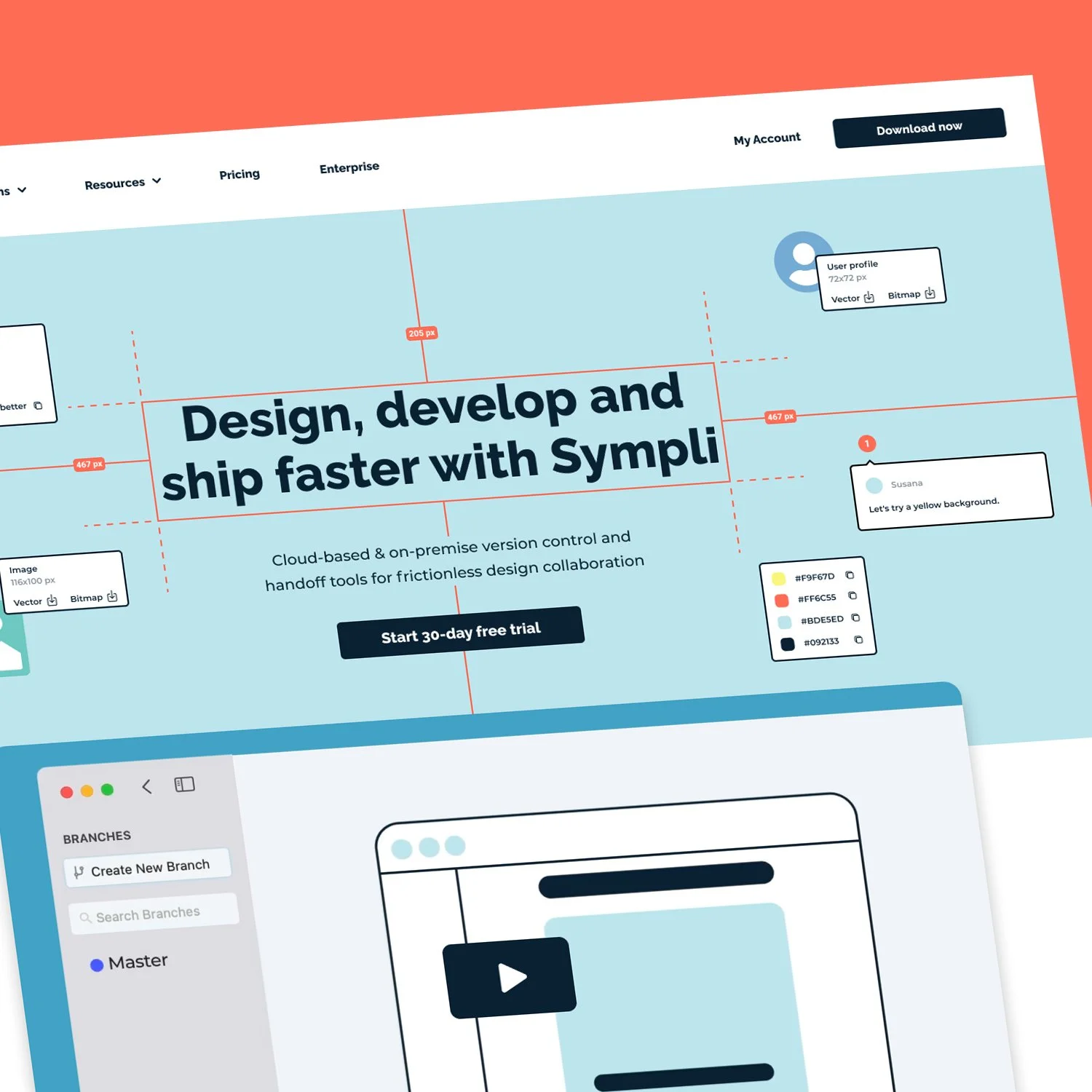
Sympli is a DesignOps platform offering advanced version control and handoff tools for frictionless design collaboration. Their clients include Mercedes-Benz, Visa, Blue Apron and many more world known companies.
I led a team of designers to create a brand refresh and website design (sympli.io) to align with their values and modern look.
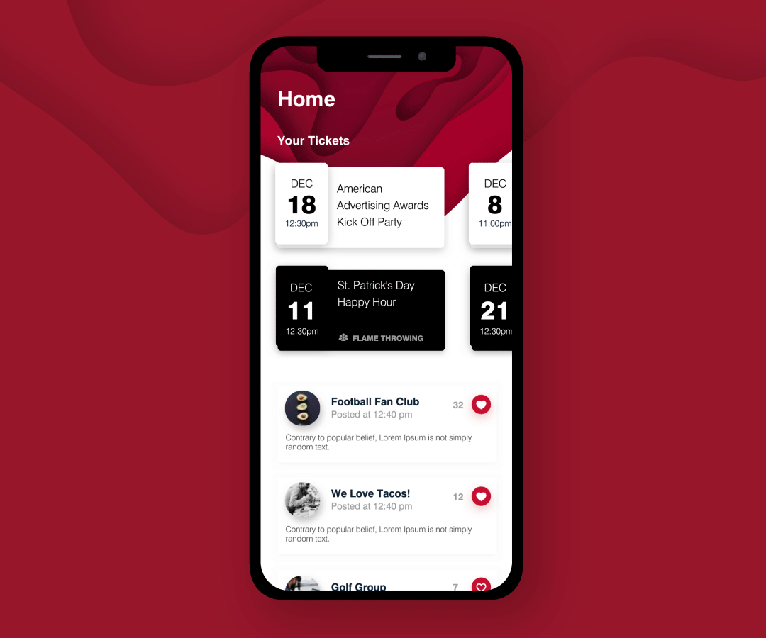
- Designed an enterprise-wide social networking mobile application for a $1B+ global company with offices across Europe, Asia, and the Americas
- Responsible for end-to-end development, including wire-framing, prototyping, functionality, usability testing and art direction.
My Role:
Led user research including information architecture, interaction design, wireframing, user interface art direction, iteration & implementation. Worked alongside with our App Developers, Content Strategist and collaborated with 2 more designers on a few screens.
Background:
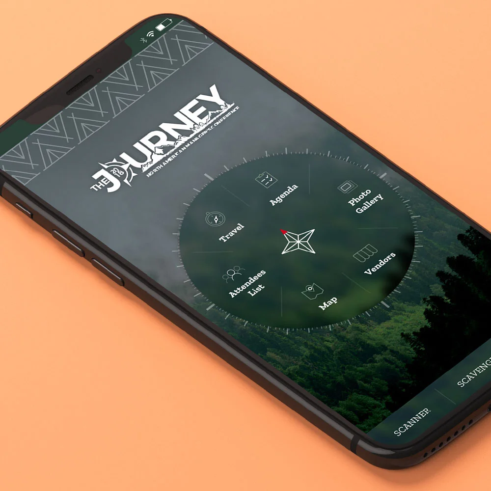
City Electric Supply is a family-owned electrical wholesale distributor dedicated to providing the best customer service in the United States since 1983.
The Challenge
Every two years, CES hosts its North American Managers conference. At this year’s installation, more than 1,200 employees converged for three days of learning, celebration, and networking.
For NAMC 2018, CES wanted to create a mobile application to give users a reason to spend more time with the event’s many vendors in a fun and interactive way. The goal was to prompt users to engage with all booths and spend more time looking around and exploring products they may have otherwise missed while at the conference.
The Solution
We created a scavenger hunt within the NAMC Mobile App by integrating an augmented reality camera interface and machine learning to recognize items and reward users for finding those items. This allowed users to collect badges and earn points by scanning items located throughout the conference with their mobile camera. Items were selected in two categories: fun items that were mostly random and outside the counter day area, and booth items that were vendor products. The fun items were designed to engage users with the environment and location, and the booth items were designed to engage users with vendors.
Users could also see a list of all the available badges, each one with a hint associated with its location. We placed 65” flat screen displays throughout the venue to show the leaderboard of the top 20 participants in real time, along with some info about the app and a scrolling marquee at the bottom with information. The screens made attendees more aware of the app and the scavenger hunt and gave the point leaders a chance to show off their status.
The Results
91,905
Total points collected by all users
3,995
Total badges collected
10
Users found all the badges
City Electric Supply is a family-owned electrical wholesale distributor dedicated to providing the best customer service in the United States since 1983. We partnered with them to develop a mobile application to encourage brand interaction in a fun and relevant way.
The Challenge
City Electric Supply wanted a new way to engage with their customers, suppliers, and employees that didn’t feel like an advertisement or a marketing campaign. Many of their branches were already running fantasy football pools on paper, so expanding this idea into something that could reach a much larger audience seemed like a great choice.
The Solution
Picks by City Electric Supply was developed by Eighty Three Creative as a native app for both iOS and Android. The game follows the 2018-2019 NFL season schedule and users make their weekly picks up to one hour before kickoff. As the games complete, we tally the scores of the user’s correctly picked matches, which are shown on the weekly leaderboard.
This approach has two main advantages. By asking the user for new picks every week, we keep engagement high in the app throughout the season. Clearing the leaderboard each week also gives users a level playing field and the opportunity to jump in at any point in the season and still reach the top of the charts to win prizes.
To make this a successful marketing campaign and build revenue for City Electric Supply, we reached out to some of the client’s more established vendors and sold advertising spots within the app itself. This revenue is used to award prizes to the top three places on the weekly leaderboard, which gives a great incentive to keep playing the entire season. The goal is to keep some of the existing brand elements in addition to the app’s own brand identity to increase mindshare.
The Results
Overall average 4.8/5 stars from 354 ratings on the iOS store 21.9% of active users have the CES app installed.
473,922 Ad Impressions
8,117 Ad Clicks
389,900 Picks Made
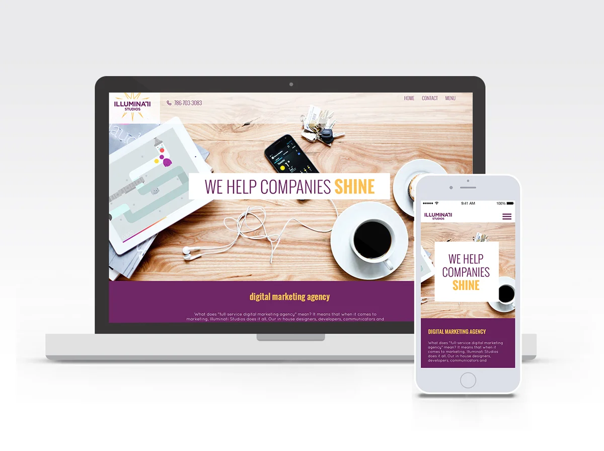
This is a website redesign for the creative agency "Illuminati Studios". Illuminati Studios wanted a brand that reflected their hip creative team that was both professional and approachable. My role in the project was to develop the general look of the all the corporate identity pieces (brand typography, color, & photography choices) and to direct the photo session. All team was very happy with the results.
Eddie Ojeda's (from the heavy metal band Twisted Sister) award-winning hot sauces has exploded on the hot sauce scene. Eddie engaged our company to develop the logo and three label designs for the sauces, where I was a lead designer on the project. One of the challenges was making a grungy, rock-n-roll looking design while, at the same time, being extra clean. The client wanted to see too much stuff on his sauce labels: himself, Dee Snider, his guitar, fruits, logo and his story.
In the end, he was very satisfied with the logo and the labels I created.