Overview
Together with a content strategist, marketing team, and the Foundation's CEO, we set out to create a Fediverse Starter Page — a single educational resource to help people understand the open social web. The project grew into something much larger: a complete brand redesign and multi-page website experience. My role focused on the visual side — translating strategy and research into a brand identity system and website design that made a complex, technical ecosystem feel human and approachable.
The Challenge
The Fediverse is technically powerful — but for most people, invisible. Existing resources were too abstract, too jargon-heavy, or inconsistent, leaving newcomers confused about what the Fediverse even is, let alone why they should care. The challenge wasn't just explaining a protocol. It was translating a decentralized ecosystem into something that felt approachable and worth joining — across five very different audiences, all at once.
Research
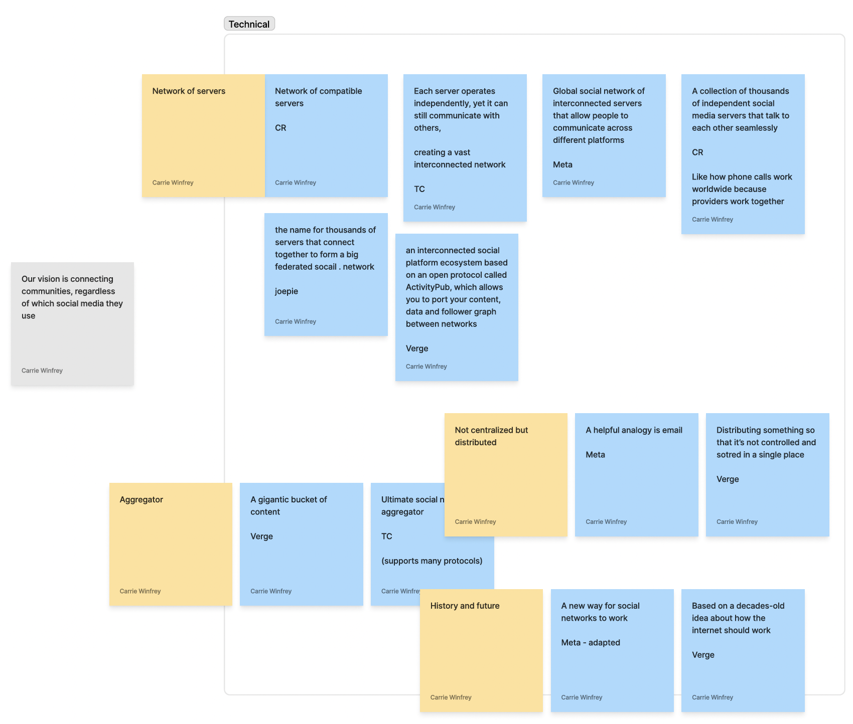
Research shaped everything. Before any design decisions were made, our team conducted a content audit of how the Fediverse was being described across major publications, platform sites, and podcasts — categorizing every definition as Technical, Tangible, or Macro. That framing became the backbone of the messaging strategy. We then interviewed six Fediverse users across different geographies and experience levels, exploring how they found the platform, where they got confused, and what kept their networks from joining. Their words cut through the theory and told us exactly what the website needed to say.
What we learned
Research surfaced four consistent themes: interoperability confused everyone — users couldn't tell what was technically possible versus simply not built yet; ethics alone wasn't enough to drive adoption, since most people join platforms based on habit and where their audience already is; the real blocker was an audience problem, not a design problem — the creators and institutions people follow just aren't there yet; and the most compelling value proposition wasn't freedom or decentralization — it was portability. 'You don't have to be stuck' landed harder than any explanation of federated servers.
Finding the right voice
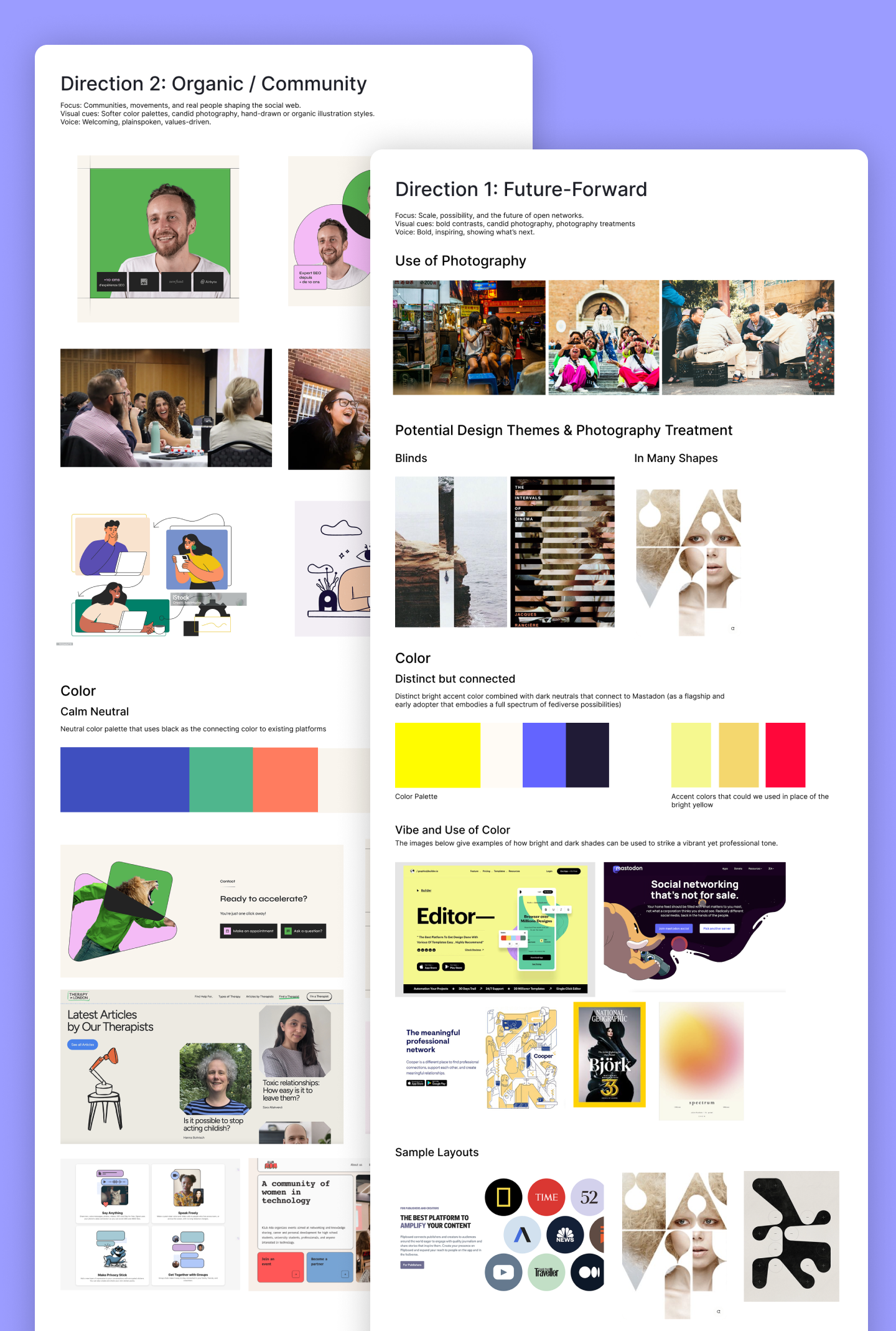
Before any visual exploration, I defined the brand traits that would guide every design decision: credibly professional for funders, plainspoken for everyday users, and inspiring enough for movements to see themselves in it. I developed two moodboard directions — Future-Forward, with bold contrasts and dark backgrounds, and Organic/Community, with a softer, warmer palette rooted in human connection. The team loved elements from both and asked me to combine them. The final direction took Future-Forward's bold energy and striking black-and-yellow palette and layered in the warmth and authenticity of the Organic direction through candid, human photography — creating a brand that felt both visionary and grounded.
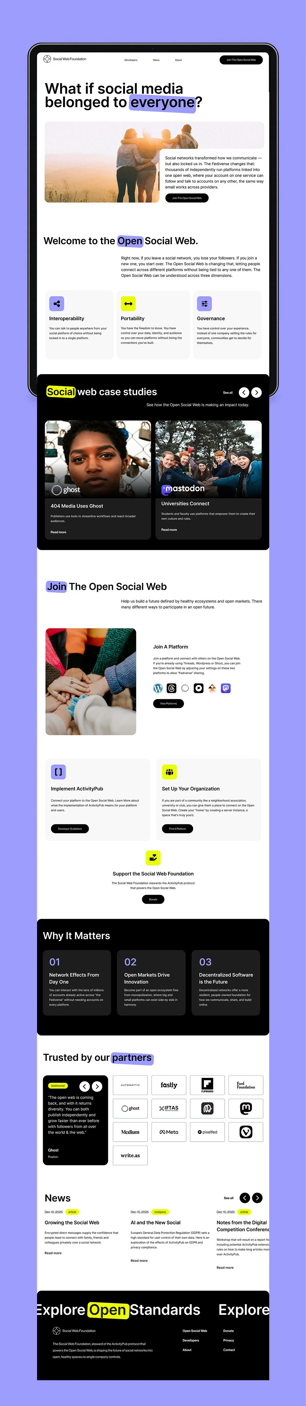
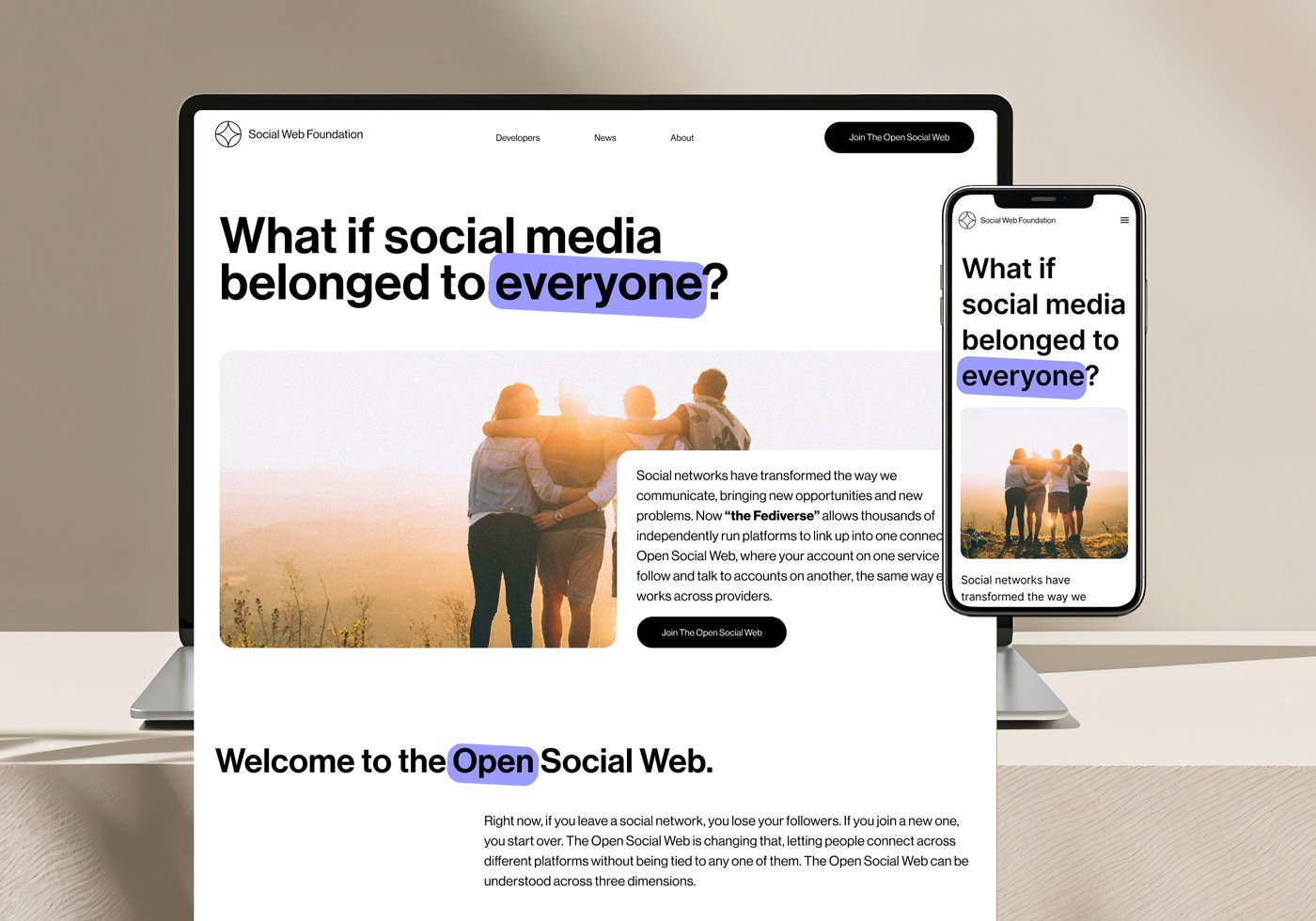
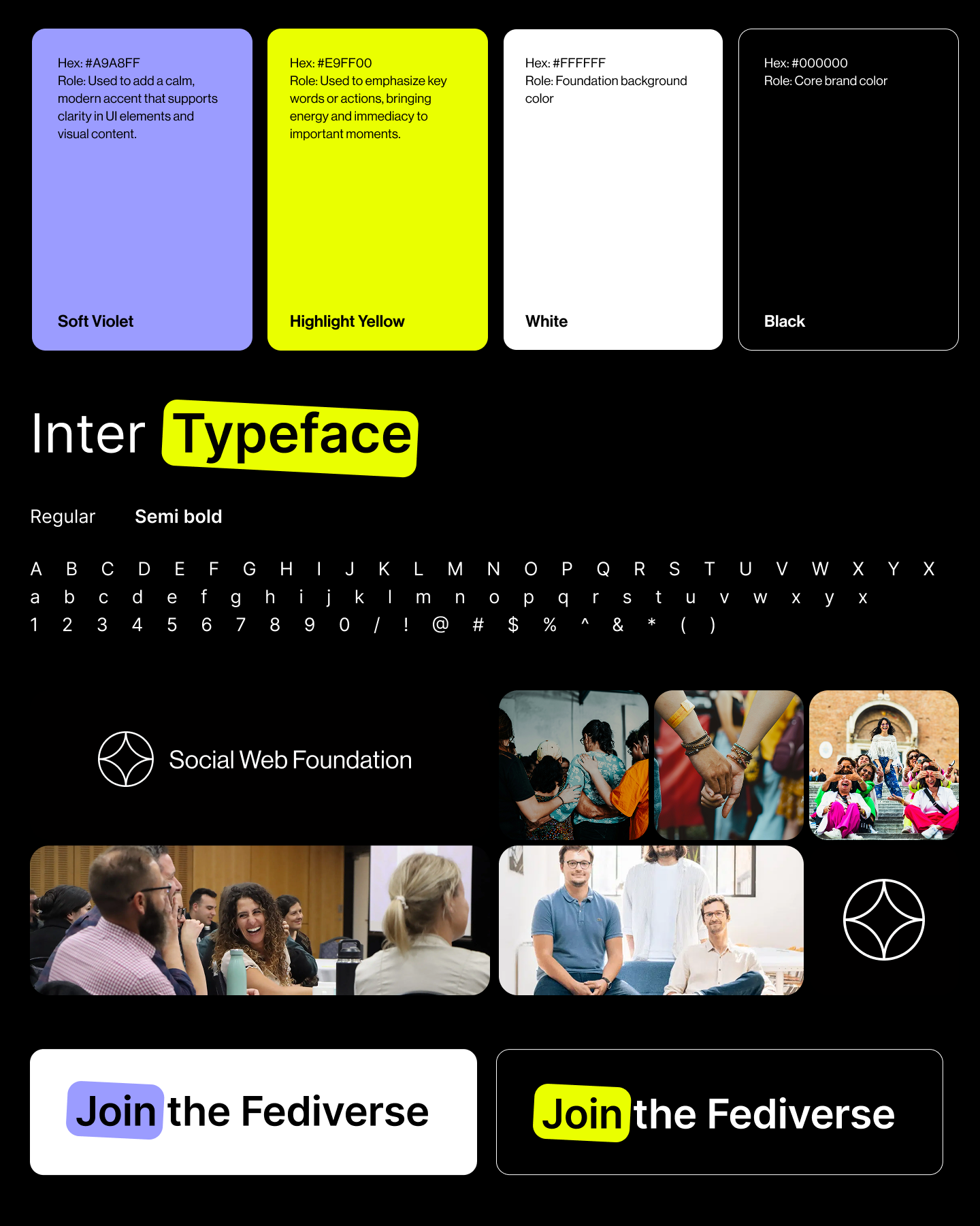
Visual identity built on clarity & momentum
The identity system is intentionally minimal: black and white as the foundation, with Highlight Yellow and Soft Violet used sparingly to direct attention and signal energy. A signature device — the rotated filled highlight — emphasizes key words and actions throughout the experience. Neue Haas Grotesk Display Pro carries the voice: bold for headers, lighter for body, always clean and human. Photography follows the same principle: candid, diverse, and real — never polished stock. Every element reinforces the same idea: the social web belongs to people, not platforms.
From architecture to experience
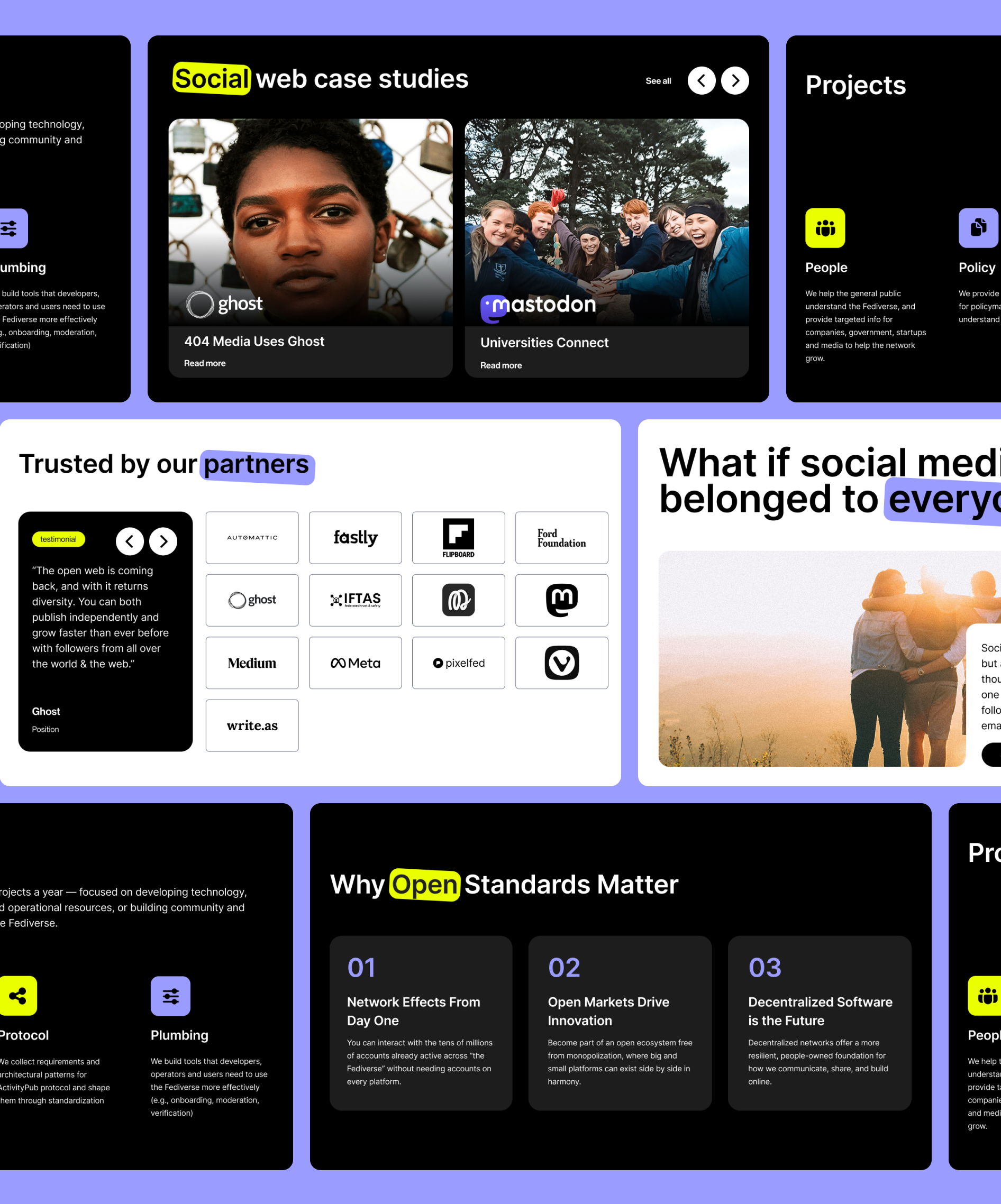
Research directly shaped the information architecture. Instead of organizing pages around the Foundation's internal structure, we built around what users actually needed to understand and do — resulting in six distinct pages, each designed for a specific audience and intent: a homepage that earns trust within the first scroll, a developer page that shifts to precision without losing brand energy, an open standards explainer that makes a complex topic scannable, an about page anchored in real photography, a join page with role-based routing for five different audience types, and a news hub built to scale.
What this project taught me
This project challenged me to design not just a visual system, but a way of thinking about a complex, decentralized ecosystem. The biggest barrier to Fediverse adoption wasn't technical — it was emotional and conceptual. People didn't know where they fit, what was possible, or whether it was worth figuring out. Every design decision was an answer to that: bold, accessible typography over techy aesthetics; leading with 'What if social media belonged to everyone?' instead of an explanation of ActivityPub; candid photography to make an abstract network feel human. The highlight system became a metaphor for the project itself — drawing attention to what matters most.